These pages are a (rambling) collection of memories and stories from my days as a graphic designer with CBC Television in Vancouver.
I worked in the design department (on and off) for over 7 years, between September of 1975 and November of 1982.
It's been over 40 years since then, so it’s likely I’ve mixed-up and/or forgotten many names, dates, and other details from that time. My apologies in advance to anyone I’ve left out, and also to anyone who may have preferred to have been left out.
In the Beginning
While growing up in Vancouver's West End during the 1950's and 60's, I must have passed-by the CBC studios on West Georgia Street hundreds of times. However, the first time I entered the building was in early 1975, during my second year of college, courtesy of a one-week internship in the graphics department.
That internship was one of three arranged for me by Herman Itzinger, head of the “Art in Merchandising” program at VCC, Langara. The two other internships were with the graphics department at BCTV in Burnaby, and the display department of the main Eaton’s store in downtown Vancouver.
Of the three, I enjoyed my experience at CBC the most, and dreamed of landing a position there one day.
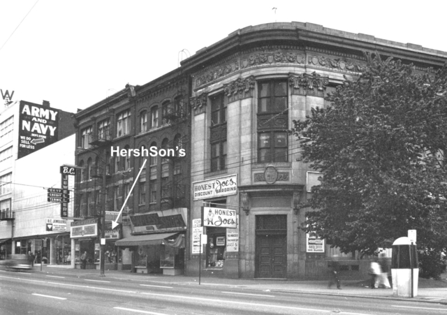
After graduating from Langara in June of 1975, I ended up working at Hershson’s, a clothing store located at 9 West Hastings Street. Even then, it was considered a rough neighborhood, (but nothing like it is today).
I sold powder-blue leisure suits, leather “Biker” jackets, stetson hats, high-waisted pants, and many other types of inappropriate attire to (often) less than sober customers.
HershSon's Clothing Shop 9 West Hastings Street (Vancouver City Archives)
Every few weeks I would call the CBC Design Department to “follow-up” and ask if there were any openings in the graphics department. To my surprise, during one of those calls I was asked to come in for an interview.
I organised my portfolio, and a couple of days later during my lunch break, hopped on a bus and headed over to the CBC building on West Georgia. I was met in the lobby by (the imposing) Ebba McRoberts and led past the costumes, makeup, sets, and graphics departments, to the office of John Williams, head of the Design Department.
Mr. Williams took his time and kindly showed interest in my work as he went through the portfolio. He asked about my current job, and seemed to imply the opening in the graphics department, (Assistant Graphics Designer), might not be right for me.
I told him I wasn't happy at the clothing store and, besides selling strange apparel to strange customers, I was now tasked with making all the in-store signs during any of my free time there. That seemed to move the interview in a more positive direction, and a day or two later I was offered the job.
Weeks later, I discovered that the previous “Assistant Graphics Designer” had quit suddenly and my follow-up phone call had come at an extremely fortuitous time.
I started working in the CBC Design Department in September of 1975. I was 19 years old, very naive, and still living at home with my parents.
Assistant Graphics Designer
Most of the offices in the design department, including the hot-press room, were located on the north-west corner of the ground floor, and had double-height ceilings. Two or three set designers offices were located nearby in a mezzanine area, up a short flight of stairs.
CBC Building 1200 West Georgia Street, 1958. (Vancouver City Archives)
I remember the department as being rather dingy and dusty. The clunky, broken-down wooden desks and cabinets looked as if they might have already been hand-me-down pieces of used furniture when the studios first opened in the early 1950’s. But, I didn't care. I was excited to be there.
The “Design Department” can refer to all the creative departments involved in a television production such as sets, graphics, costumes, make-up, props, scenic art, carpentry, staging, and so on.
The “Design Department” can also refer to the area where the graphic designers and set designers have their offices, (that's where I worked).
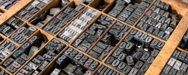
My job was to operate the hot-press machine and churn out white-on-black “supers” for the nightly news and other programs.
I received a few brief instructions, from Dan Philips and Rick Staehling, on how to operate the hot-press, and it didn’t take long to get the hang of setting the upside-down, backward, metal type in the heating trays used to “press” white text onto black cards. But, it did take weeks to become familiar with the multitude of typefaces stored in the flat wooden trays that lined the hot-press room.
Example of a tray of metal type for a hot-press machine
As an “assistant graphic designer” I felt like a short-order cook toiling over a hot stove, filling various orders from production assistants and designers. I loved it.
Hotpress room sign. Stamped with "gold" foil instead of the usual "white".
First Big Job
My first “big job” was to create several multi-line supers for the evening news. I spent a lot of time on these to make sure everything was perfect before sending them to the studio.
Shortly before the supers were used, I quietly slipped into the studio and found a headset to listen-in on the communications between the control room, cameramen, and stagehands. No one knew who I was but, being out of the way and in a dark corner, they left me alone.
A studio camera focused on the first graphic and I was thrilled to see my work displayed on the monitors.
Then, the Switcher in the control room pulled up a horizontal wipe. WTF?! And, it soon became clear my perfect lines of type were not so perfect. Some lines were higher on the left, some on the right.
Through the headphones I could hear the snickering and jokey remarks among the crew. The most painful comment (I’ll never forget) was, “Bucky must have had too much to drink at lunch today. Ha-Ha”.
“Bucky” was the fellow who had quit suddenly, and whose job I now had. Most people didn't even know he was gone yet.
It was too late to do anything about the supers, so I slipped out of the studio and went back to my hot-press room.
The experience was humiliating, and likely contributed to my later obsession with always trying to make “perfect” supers, credit rolls, and other types of graphics.
Considering the low-resolution and poor reception of broadcast television in the 1970’s, “perfection” was usually a waste of time. And, I still didn't understand the expression, “Good Enough for Television”, commonly used by the senior designers to keep their work in perspective.
I soon got over that experience in the studio and settled into my job. I also bought a large, professional-quality right-angle ruler so I could double, and triple check, the level on all my future graphics.
In 1975, CBC was already broadcasting in color, but many people still owned black & white television sets, and the designers had to be careful about how their color combinations would be perceived in B&W.
Several designers used a special hand-held lens for checking the contrast levels of their color artwork, and Jeff Pritchard still had a full set of grey-scale paints lined-up along his drawing board for working on B&W graphics.
The Group of Seven
When I started working at CBC in 1975, there were three graphic designers, three set designers, and one assistant set designer. The graphic designers were Jeff Pritchard, Kuni Masada, and Rick Staehling. The set designers were Victor Miles, Murray Devlin, and Lawrence Collett. The assistant set designer was Dan Philips.
Unknown to me at the time, one or more designers were probably up at Gibson’s working on "Beachcombers".
It was a privilege and a pleasure working alongside these guys, and it quickly became clear they were highly professional and extremely talented artists. I would learn so much from them.
Rick Staehling quit soon after I arrived. But, before leaving, he gave me an earful about how terrible it was to work in the CBC Design Department. I never heard that kind of negativity from any of the other designers, (except, maybe from Jeff), and I suspected he wasn’t getting along with John Williams. It's too bad, Rick was a good designer, and I could have learned a lot from him.
Rick later became well-known for his work as an art director for Vancouver Magazine, university lecturer, consummate film buff, and respected film critic with the CBC for over three decades.
When I first met Dan Philips he was building a large-scale model of the deck of an old pirate ship. I thought he had "The Best Job In The World". The model had wood planking, barrels, a large mast, rope ladders, and countless other details. It was beautiful. But, it was only one of several detailed models Dan would build for use as chromakey sets on the Irish Rovers programs. Those shows, produced by Ken Gibson and directed by Michael Watt, were pioneering the creative use of chromakey in video productions.
Originally a garage, the CBC building on West Georgia had a support column in the middle of its larger studio. This posed a recurring challenge for the designers, and most sets had to include a tree, lamp-post, ship’s mast, or anything else that might be fitting to hide or incorporate the column.
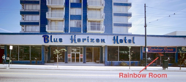
An almost daily routine in the design department was our mid-morning coffee-break at the Rainbow Room on the ground floor of the Blue Horizon hotel on Robson Street. I always looked forward to these as a chance to "join the gang”, which usually included Jeff, Kuni, Victor, and Murray.
The Blue Horizon on Robson Street Photo: Vancouver City Archives
One morning, the mood at the table was gloomy. Murray Devlin wasn’t talking much and kept staring down into his coffee. He was going through a divorce. At one point Murray looked up just as three women cheerfully passed-by on the sidewalk outside. He lowered his head again and said wistfully into his coffee, “I used to have one of those.” Everyone burst out laughing, and even Murray cheered up after that.
Another time, the discussion revolved around the upcoming wedding anniversary for Victor Miles, and the gift he should get for his wife. We arrived at silver for 25 years, pearls for 30, ruby’s for 40, and so on, but no one knew what the gift was for Victor’s anniversary year. (It was many more years than my age.) Finally, I blurted out, “I remember now, the gift for your anniversary year is pre-stressed concrete.” I’ll never forget Victor’s momentary silence, then hearty laughter, and how good it felt to make him laugh like that.
Lawrence Collett was someone I quickly grew to respect and look up to. At first, I thought he was kind of shy. Then, one morning, Lawrence walked into the design department with his head shaved bald and wearing calf-high fluorescent green boots. He went about his day as if nothing was unusual.
I finally worked up the courage to ask him about the bald head and boots, and he calmly answered, “Lost a bet.” I doubt if that’s what really happened, and later came to realize Lawrence was not shy. He was brilliant, extremely creative, and perhaps a bit eccentric.
Jeff Pritchard would often share stories about his early days in England when he was a commercial artist. One of my favorite stories was about the annual year-end holiday season when he would illustrate all kinds of luxury goods for ads in London newspapers.
Various products were brought to the studio where Jeff and his fellow artists would use them as reference to create the illustrations. When the work was completed and it was time to return the products to the client, Jeff said some of the more expensive items would always have mysteriously disappeared, or in the case of especially fine bottles of wine or champagne, have miraculously transformed into water.
Kuniyoshi Masada always seemed to be in good spirits, constantly telling jokes and instigating pranks, (more on that later). Kuni grew up in Kobe, Japan, and graduated from the Namba College of Design in Osaka. He came to Canada in 1967 and concentrated on fine art studies for several years before joining the CBC in 1972.
It was always fun to be around Kuni, and he even had his own catch-phrase, "Howdy Boys", which he delivered in a deep, long drawn-out cowboy voice... with a Japanese accent. He was also known in the design department as "Kuni O'Shea", the nickname Dan Philips gave him.
Beyond Supers
My initial job of only creating supers on the hot-press machine soon expanded to include providing graphics for the nightly news, and I started making the full-screen maps, graphs, and story-related graphics chromakeyed behind the news anchors.
One of my favorite news graphics was the two-camera “animated reveal”. One camera would shoot a full-color map or graph, while a second camera, registered to the first, would capture the specially prepared, white-on-black, super. The “animation” was accomplished by a stagehand pulling a piece of black card to reveal the super. Incredibly, (by today’s standards), this was often done “live” to air during the broadcast.
One of my least favorite graphics assignments was making the supers for a televised hockey game. I’d usually have to stay late and wait for a production assistant to bring the official list of players from both teams, plus the text for any anticipated between-period graphics. It was always a stressful rush job involving dozens of individual graphics cards.
BTW: You had to respect the skill of those stagehands who could instantly place the correct player-name supers in front of a camera during those live hockey broadcasts.
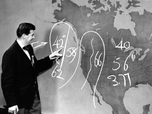
The Weatherman
It took me a while to get used to meeting and chatting with all the “Famous TV Personalities" at the CBC. And, one of the most famous, for me, was Bob Fortune.
As a kid, I regularly watched the weather forecast on the CBC evening news. Not because of any interest I had in meteorology, but because my dad was a huge fan of Bob Fortune. The nightly weather report was one of the few things on TV my dad had to watch, and he would adjust his daily plans based on Bob's forecasts and pass along Bob’s predictions (with attribution) to others.
I would often pass Mr. Fortune in the hallways, studio, and newsroom. But, I can’t recall ever exchanging a single word with him. I was probably too “in awe” of him, and of course, he never needed any graphics from me for his weather segment. Bob always created his own detailed weather graphics on the big map, in real-time, using only a piece of chalk.
Bob Fortune, 1966 photo: Alvin Armstrong, CBC Archives
On My Own
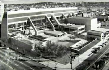
I wasn't aware of it when I was hired, but the CBC was constructing a new state-of-the-art production centre at 700 Hamilton Street. The goal was to combine all the CBC radio and television operations that were spread out across various locations in downtown Vancouver into one large facility.
CBC. 700 Hamilton Street, 1975 photo: Stationbreak.ca
It wasn't long before the new facilities were completed and staff members from various departments began moving into the new building.
Eventually, all the designers moved to Hamilton Street, (except me), and the only production still originating from the West Georgia Street studios was the nightly news.
I received a “TUG” (Temporary UpGrade) to full Graphics Designer, and remained at the old building, working by myself in the now empty design department.
It was a lucky break. I was now responsible for all the graphics on the evening news, as well as supers and credit rolls for shows being produced at the Hamilton Street studios.
I also had an office in the new building and would occasionally spend my mornings there, but return to West Georgia by the afternoon to work on the nightly news graphics.
The higher salary from the “TUG” (which became a permanent upgrade. PUG?) was also an unexpected extra, allowing me to finally leave my parents home and rent an apartment in the West End. I was livin' the dream.
Gerri Barrer Teaches Me a Lesson
One day I found a large “Canadian Broadcasting Corporation” sign abandoned in the empty design department. It had probably been used at some outdoor event and was being thrown out.
I got “creative” and repurposed the sign to read...
...and hung it on the wall above the hot-press machine.
The sign was impossible to miss for anyone passing through the design department on their way to or from the newsroom on the second floor, and it wasn’t long before Gerri Barrer, a reporter on the nightly news, came down to confront me about the meaning of the sign.
I didn’t have a good answer, other than, “I thought it was funny”. (Immature, 19 year-old humour.)
Gerri was very patient with me and explained how inappropriate the sign was and that it was insulting to her and the other women working there.
She was right. I was embarrassed, and immediately removed it.
Gerri taught me an important lesson that day, and we became friends.
We went out several times after that, (nothing romantic, just friends), including going to the first "Rocky" movie when it was released in 1976. I still smile when I think about Gerri cheering so loudly, (along with many others in the theatre), during the climactic fight scene.
A Healthy Lunch
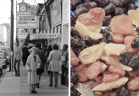
At the time, I knew little about food, cooking, or proper nutrition. I did know fresh fruit was considered healthy and came to the conclusion (naturally) that dried fruit, with all the goodness of whole, fresh fruit condensed into small, bite-sized servings must be "super healthy".
So one day, before noon, I walked up to "Galloway's" on Robson Street and bought a large variety of dried fruit, (maybe 2 pounds), which I ate for lunch.
Galloway's on Robson Photo: Vancouver City Archives
Around one o'clock I started feeling woozy, and by two, I was really sick.
I rarely missed work due to illness but couldn't take it anymore and went to Chris, Sharon, or one of the production assistants in the news department and told them I was sick and had to go home.
Calls were made and Kuni came over from the new building to handle the graphics requirements for that evening's news broadcast.
I was back to work the next day, thankful that Kuni had covered for me, and with a lesson learned about eating too much dried fruit.
Last Broadcast from West Georgia
I clearly remember that last news broadcast from CBC’s 1200 West Georgia Street studio.
During the broadcast, various set pieces were removed, and by the end of the show Harvey Dawes and Judy Piercey were standing in a completely empty studio, informing viewers this was the last broadcast from CBC’s historic West Georgia Street location.
As the anchors began their final sign-off, a stagehand and I were given our cue to cross the studio floor in the background, sweeping-out the last remaining debris with large brooms. (My first appearance on live TV.)
That night, during the after-party in the newsroom, there was little concern for the old building. Even a shower of broken glass tubing, caused by Gerri Barrer popping a champagne cork into the overhead fluorescent lights, just made everyone laugh. The air was filled with the excitement and optimism of our move to the new Hamilton Street facilities.
In June of 2021, while browsing the internet, I came across stationbreak.ca, home of "The CBC/SRC Association, BC Chapter". This active site boasts a rich collection of photos and stories from the old CBC days, along with many recent contributions from former CBC'ers.
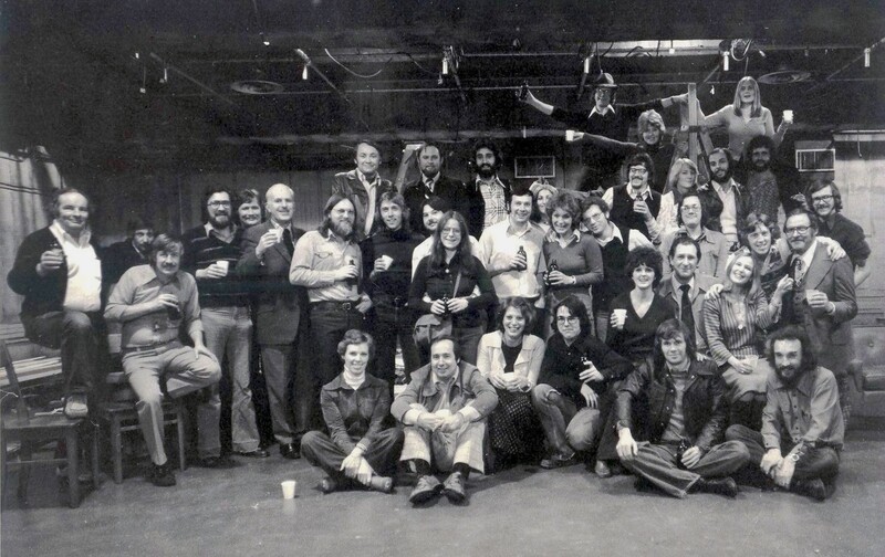
After exchanging several emails with Peggy Oldfield, she sent me the photo below, taken in the studio on the night of the last news broadcast and after-party back in 1975.
It was the first time I'd seen it, and all the faces and names triggered a flood of memories, becoming part of the inspiration for me to write these pages.
I'm missing from the photo because I was in the darkened make-up room, eagerly awaiting the return of LB so we could continue our "passionate kissing" session. Years later, LB confessed she had been doing the same thing (at least) with MV, somewhere else in the building that night.
Hourglass Evening News Crew, 1975 (Last production from 1200 West Georgia) photo: Peter Allies
Crew Photo List
On ladder l to r: Taylor Ogston (director), Chris Paton (producer/director), Trish Robinson (reception)
Back Row: Fred Engel (video), Carl Pederson (video), Eli Gorn (audio), Gunther Zellmer (lighting), Linda Brown (makeup), Mike Varga (camera), Peter Dobo (camera)
Middle Row: Gerry O'Connor (film lighting), Brian Charloe (carpenter), Bob Hepworth (audio), Jim O'Brien (lighting), Bernie Stansfield (staging), Perry Eaton (VTR), Warren Chenery (VTR), Brad Baldwin (VTR), Bruce Johnson (mobile maint.), Cathy Patton (VTR), Ted Ball (maintenance), Unknown, Unknown, Will Carrilho (TV tech), Travis ?, Jeff Hill (TV tech)
Front Row/Floor: Wendy O'Flaherty (news reporter), Ron Thompson (camera), Gerri Barrer (news reporter), Bruce Galt (researcher), Barb Dennis (reception), Bob Reid (TV switcher), Harvey Dawes (news anchor), Judy Piercey (news reader), Unknown, Jack Wasserman (host), Norm Rosen (film sound)
The atmosphere was also bittersweet. For many of the old-timers it must have felt like the end of an era, and I’m sure most of them had mixed feelings about how their work and life was about to change. They were a small, tight-knit "family", who had worked closely together for many years.
700 Hamilton Street
The next week, we were spread-out across the block-long, multi-story building on Hamilton Street. My office in the design department was at the far, south-east corner of the 2nd floor (level 5), the news department was on the 1st floor (level 4), the control rooms were on level 2, the studios were on level 1, and new employees were... everywhere.
Everything was newer, bigger, better, and we were now a much larger “family”.
The design department was awesome! Every designer had their own large cubicle, including a window with a view! The graphic designer's offices were located along the East side of the building and the set designers were on the West side.
Each office came equipped with a super-sized top-of-the-line drafting table, matching cabinets, storage drawers, state-of-the-art drafting lamps, and so on.
The only thing that wasn’t new was the hot-press machine. It, and the dozens of trays of metal type (probably weighing several tons) had been brought over from the old building.
The hot-press machine probably should have been left behind and scrapped. We rarely used it once we moved to the new building. The decades-old type was worn and damaged, and most supers made on it had to be touched-up with black and white paint before they could be used on air.
Additionally, electronic character generators were now being used to create supers for the news and sports broadcasts. Which meant, no more last minute graphics for hockey games. Woo-hoo!
However, the character generators at the time had a simple and limited font selection. Fine for news and sports, but inappropriate for dramas, comedies, variety shows, and other programs.
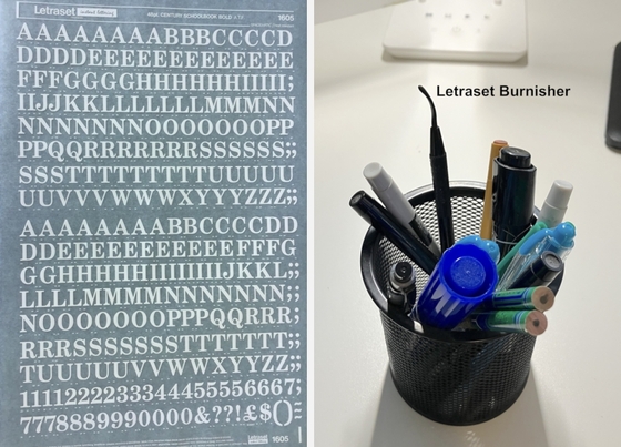
When practical, I would use "Letraset" instead of the hot-press. Letraset was sheets of type that could be transferred by manually rubbing one letter at a time with a "burnisher".
Sheet of Letraset And, a burnisher still on my desk in 2023!
It was a mind-numbingly tedious process, especially when making long, closing credits for roll-drum machines. But, the selection of Letraset typefaces was almost limitless and allowed me to continue my quest for "perfect" graphics. (It also caused me to rack-up a lot of overtime hours, and repeated scoldings from management.)
The new hot-press room also included a small dark-room with a PMT (Photo-Mechanical-Transfer) machine, and (luxury of luxuries) a deluxe, super-ventilated, brightly-lit, spray booth with high-end air-brush compressor.
Unfortunately, as with numerous other “design faults” that soon become apparent throughout the new building, the spray booth never worked properly. You could switch on the fan and hear a lot of noise, but very little air was actually sucked out. We were supposed to be able to safely use air-brushes, spray paints and, most evil of all, spray glue. Instead, we quickly learned to hold our breath while using the spray booth and rush out as soon as we were finished, or out of breath, whichever came first.
After many months and repeated visits by the building’s head engineer, (apparently a former NASA engineer), we were informed that due to ducting designs, bypass ratios, pressure differentials, axial compensators, quantum mechanics, and other such reasons, nothing could be done to increase the air-flow. So, the spray booth ended up being used as little as possible.
We also had a new Head of the Design Department, Gerald Trottier. Gerald had a distinguished design background with CBC and other institutions in the Ottawa area, and was already an internationally recognized artist when he came to CBC Vancouver. He had a much more hands-on approach, (compared to John Williams), and was often in the design department interacting with designers, and keeping abreast of the productions. Gerald was greatly respected by the designers.
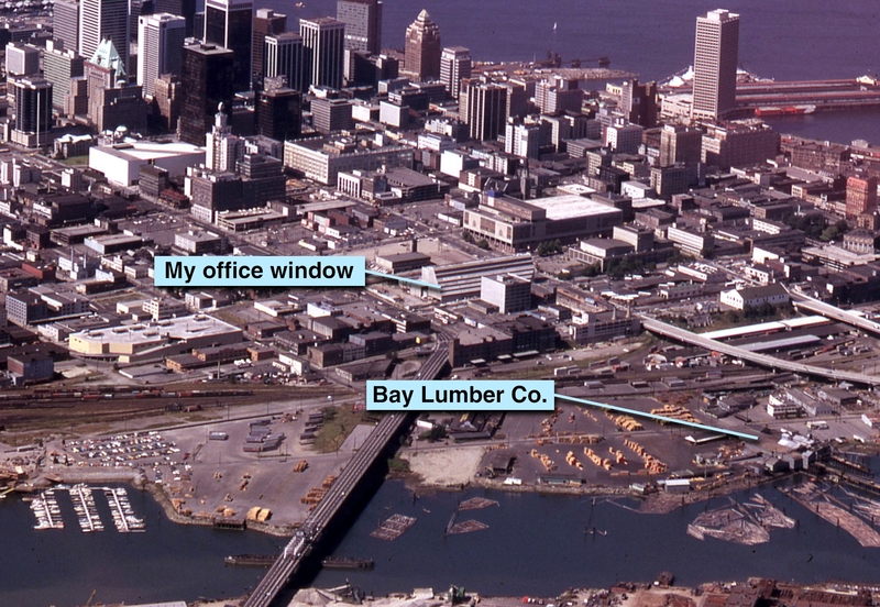
The Bay Lumber Company
My office had a great view overlooking the city toward the South-East, and on clear days I could see snow-covered Mt. Baker down in Washington State.
Also out my window, and only a few short blocks away on the north side of False Creek, was the Bay Lumber Company. This was the saw-mill where my father worked. He operated the powerful machines that pulled huge logs out of the water, stripped off the bark, and sawed them into smaller pieces in preparation for processing through the rest of the mill.
CBC & Bay Lumber Company Photo: M. S. Horne, 1974
By 1975, my dad had already been at the mill for many years, working his way up from the back-breaking job of manually pulling heavy pieces of finished lumber from the “green chain” and stacking them onto sorted piles. He worked outside in that noisy, dirty, dangerous place during all kinds of weather.
This probably accounts for my dad's obsession with watching Bob Fortune's forecast every night.
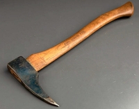
Over the years he’d seen all kinds of accidents, including bone-deep cuts, crushed limbs, and even one man accidentally fed into a “chipper”. On top of that, fights would occasionally break-out between men using “pickaroons”, resulting in severe injuries.
Pickaroon
There I was, only a few minutes away, sitting at my desk in a climate-controlled office, "working" with colored pencils, felt tip markers, paint, bits of paper, and glue. The most dangerous item in my office was an exacto knife.
I don’t recall ever thinking about my dad working there below me during my time at CBC.
And, it’s only now, decades later while writing this, that I’m struck by that realization.
Worst. Job. Ever.
During the summer of 1974, thanks to my father, I had a job at the Bay Lumber Company. It was called "Clean Up", and I worked the "Graveyard Shift" (midnight to 8:00 AM) once a week on Sundays. Because the mill operated three 8-hour shifts a day, and shut-down only on Sundays, this was the only safe time to work under and around the huge saws and other dangerous machinery.
The pay was good, but I hated it.
I would spend most of the night under the machinery, shovelling a weeks accumulation of sawdust and other debris into noisy, chain-driven conveyor belts, (or directly into False Creek). The debris was usually mixed with oil and other unidentifiable crap, and on rainy nights all kinds of disgusting sludge would drizzle down on me as I worked.
Did I mention I hated it?
By the end of each shift, I was dazed and half asleep. One morning I got too close to a row of huge, spinning saws and the metal shovel I was using was ripped from my hands and torn to pieces. That woke me up!
I was happy when the summer job ended and I never had to go back to that place again.
Let Us Remember
With wide-open studios, high ceilings, and state-of-the art technology, the new sound-stages on Hamilton Street greatly expanded the production possibilities. In addition, the costumes, props, carpentry, paint, makeup, and staging departments were all primed to demonstrate their expanded capabilities.
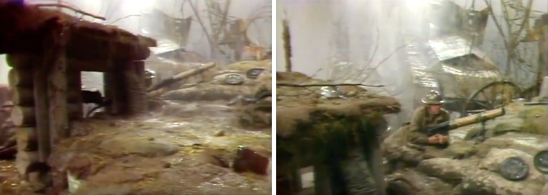
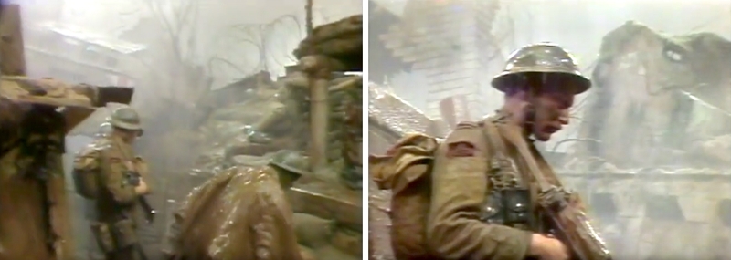
One of the earliest examples of really pushing the new boundaries was the 1976 Irish Rovers special, "Let Us Remember", with guest Vera Lynn. (Producer Ken Gibson, Director Michael Berry)
Production designer Lawrence Collett co-ordinated the various design departments and oversaw the transformation of Studio 40, the largest of the new sound stages, into a sprawling re-creation of torturous, mud-filled, WWI trenches.
Let Us Remember. Irish Rovers with Vera Lynn, 1976 Photos: ST40TV YouTube
The contrast in scale from the old studios on Georgia Street couldn’t have been starker. And, there wasn’t a single, uncalled-for tree, lamp-post, or ship’s mast, to be found anywhere on set.
And, how the hell did they deal with all that water “raining” down in a studio brimming with lights, cables, cameras, and other electronic equipment?
I rarely remember the names of the “Hourglass” anchors, but I’ll never forget Al Vitols, Chris Paton, Sharon Bartlett, and Bruce Galt. To me, they "were" Hourglass.
As far as I knew, they oversaw every detail of the show and made all the decisions regarding the content that aired each night on the news. Even to this day, whenever I see a movie or television show that takes place in a newsroom, (even a newspaper newsroom), I can’t help but think of Al, Chris, Sharon, and Bruce in the lead roles.
Even though I was "the kid", with relatively little experience, they gave me a lot of freedom in designing the news graphics, and made me feel like an important part of the team.
On-air graphics for the news was always my main assignment. No matter what productions I worked on during other parts of the day; variety, drama, comedy, sports, or game shows, by the afternoon I would be back on “news graphics duty”. Sometimes, this transition was challenging, especially after working on a “Dr. Bundolo”, "Air Farce", or other comedy show earlier in the day. News graphics tended to be serious business.
This was one of the great things about working at the CBC, especially after the move to Hamilton Street. There were so many different productions taking place in the building at the same time. You couldn’t help but build-up a wide variety of production experiences.
I often had to create graphics of famous people in the news. For this purpose, the newsroom had an impressive archive of 35mm slides of politicians, athletes, business leaders, and celebrities, and it was always our first “go-to” source for images.
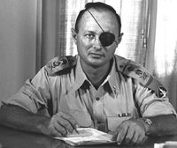
When Moshe Dayan, the Defense Minister of Israel died, of course we needed a graphic. I went to the archive, pulled out his slide, and created the graphic that aired on the news that night.
The next morning, the newsroom called informing me they had received several complaints about my previous night’s graphic of Moshe Dayan... his patch was over the wrong eye. I had inadvertently flipped the slide when making the image. Lesson learned.
Patch over correct eye Photo: GPO/Hulton Archive, 1954
Another time, just before 6:00 PM and with all the news graphics completed, I was just about to head home. Suddenly, there was a frantic call from the newsroom about a plane crash at the airport. A graphic was needed immediately but they had few details. All they could confirm was that no one was killed, and it was a twin engine general aviation aircraft that crashed on landing and ended up off the runway.
I didn’t have time to look for reference images, so I quickly sketched and painted a graphic showing a twin-engine aircraft, with it’s undercarriage scraped and it’s right wing damaged and partially buried in the grass beside the runway. I was just making things up!
When finished, I went racing downstairs, through the control room, then down into the studio, where the stagehand got the graphic in front of a camera with only seconds to spare.
The next day's newspaper stories included pictures of the crash scene. Almost everything in the actual photos looked the same as my made-up graphic from the evening before.
Spooky.
The Weather Globe
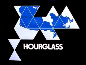
Danny Chan, a talented production designer with a clean, minimalist style, created an elegant new set design for “Hourglass”.
Hourglass Logo Design: Danny Chan
Instead of the traditional, flat “weather board”, his design called for a “weather globe”. The diameter of the globe had to be large enough to clearly show the West Coast of Canada, and allow the on-air weather person to add, (using chalk, ala Bob Fortune), high and low pressures systems, temperature predictions, and other daily forecast details. It also had to be light enough to rotate and move around the studio.
After extensive research, a company was found that could fabricate the globe with the required specifications. And, the material of choice ended up being plexiglass, costing thousands of dollars.
In late summer, to generate publicity for the revamped “Hourglass” and other fall programs, CBC entered a float in the PNE parade. The new weather globe, completely covered in small pieces of brightly colored plastic, defining the continents and oceans, was the centerpiece of the float. It looked great.
After the parade, the “float” (a flat-bed truck) was backed into the loading bay of the CBC studios on Hamilton Street for dismantling. While others were removing the truck’s decorations, two stage hands gingerly removed the globe from its support and carefully rolled it toward the back of the truck. When they reached the edge they stopped momentarily, then gave the globe a good shove.
To the sound of several people screaming, “Noooooooo”, the globe fell about 4 feet to the concrete below in what appeared to be super-slow motion. This was immediately followed by the sickening sound of thousands of dollars of expensively fabricated plexiglass cracking into several pieces.
I don’t remember if the globe was fully repaired or re-fabricated from scratch. I also don’t remember what happened to the stagehands. And, to be honest, I don’t even remember if the new “Hourglass” set ever got its fancy new weather globe.
The Cardboard Box
One day, as these things tended to happen, I found myself inside a refrigerator-sized cardboard box wandering around the design department and noisily bumping into things.
It didn’t take long before several of the designers, including Jeff and Kuni, surrounded the box and began hollering and pounding on it with their fists and other objects.
Suddenly the laughing, pounding, and shoving stopped, and it became eerily quiet.
That's when I heard Gerald Trottier calmly say something, then walk away.
After the others drifted back to their cubicles, I was left on my own still hidden inside the box, where I remained motionless and silent. After what seemed a safe amount of time, I cautiously emerged, abandoned the box, and scuttled to my cubicle like a hermit crab without a shell.
No Entrance
Kuni liked to play practical jokes, and Jeff was often on the receiving end of his pranks. One notable prank was when Kuni (with me abetting) blocked the entrance to Jeff’s office.
Our cubicles were made from strong, fabric-covered panels bolted together to form the (approximately) 6 foot-high walls. There were no doors, just door-sized openings.
One morning, Kuni and I arrived early to “procure” an extra wall panel and bolt it across the opening to Jeff’s office. Later that morning, when Jeff finally arrived, Kuni immediately called his extension so the phone was ringing just as Jeff came to the (now blocked) entrance to his office.
Kuni and I were snickering at our desks as the phone kept ringing and Jeff grew more and more agitated.
Suddenly the walls started buckling and shaking as Jeff tried pushing, kicking, and finally ramming his way through the blocked doorway.
Jeff was raging when Kuni and I finally came out from our cubicles, laughing and ready to take credit for such a great prank.
Jeff was livid, and made it damn clear he didn’t see any humor in the situation.
What Kuni and I didn’t know was that Jeff’s wife had a medical emergency the previous day and Jeff assumed the “phone call” was from the hospital.
Ouch! Another lesson learned.
Dim Sum
The CBC facilities on Hamilton Street included a staff cafeteria on the main concourse level. Instead of just 4 or 5 of us having coffee together at the Blue Horizon, as we did in the old building, the designers now went together as a larger group for their coffee breaks in the cafeteria.
It wasn’t as intimate as before, but mingling with staff from the many different departments was, I thought, a great thing.
Jeff, Kuni, and I would often leave the building to have lunch together at nearby restaurants. Kuni and I enjoyed trying all kinds of new places, but Jeff was rarely interested in “foreign” food. It took some prodding, but we finally succeeded in convincing Jeff to join us at a large Chinese restaurant on Hastings Street for a dim-sim lunch.
Jeff was visibly uncomfortable as we took our seats at a table in the large, busy dining room, and it wasn’t long before a loaded dim-sum cart stopped beside us. The woman removed the top from the first stack of containers, revealing a tangle of tasty looking chicken feet.
Kuni and I nodded, and a couple of the bamboo steamers were quickly placed on our table.
Typical dim sum lunch Photo: Internet
Before we could say anything, Jeff stood up, put on his coat, and practically ran out of the restaurant.
Bloody Nose
In the late 70’s, it wasn’t uncommon for nude dancers to perform during lunch and dinner hours in many of the pubs and restaurants in Vancouver. (Seems quite strange, now.)
Some of these women were professionally trained dancers and were regularly hired by CBC as backround dancers (wearing costumes) on "Wolfman Jack", "Rene Simard", and other musical/variety productions.
One day, Jeff, Kuni, and I were at a nearby restaurant enjoying our lunch when a dancer started her routine. Since this wasn’t uncommon, we mostly ignored her. But, it wasn’t long before she was on top of our table, making it a challenge to continue eating our food.
I was a little embarrassed and didn’t know where to look. But Jeff, sitting directly across from me, had his head tilted back, mouth slightly ajar, and his eyes locked on the dancer.
Then I noticed a trickle of something emerging from his nose, which soon turned into a flow of blood from both nostrils. Jeff’s blood pressure must have gone too high.
The dancer quickly left our table, and there was blood on all our napkins before Jeff was able to staunch the flow.
We abandoned our unfinished lunches and left as soon as possible.
We never set foot in that restaurant again.
Peg Leg
Contrary to all the designer’s cubicles without doors, there were a couple of "real" offices with floor to ceiling walls and lockable doors, at the entrance to the design department.
One of these offices was occupied by Alan MacMillan and Max Brent. Al and Max were in management and responsible for things like scheduling and payroll. I didn’t have much interaction with Al, but often met with Max who was always giving me a hard time about my overtime hours.
Whenever we entered or left the design department we had to pass Al and Max's office. And, they rarely closed their door, leading some to speculate this was so they could keep track of the comings and goings of all the designers.
One of the designers who may have believed this was Jeff, and when he wanted to leave work early, he would hide his coat and umbrella in the men’s room near the elevators just outside the design department.
One afternoon, just after Jeff left his office, Kuni grabbed me and we went to wait in front of the elevators.
Soon, Jeff emerged from the men’s room carrying a wrapped package under his arm… his coat.
We started laughing and Kuni began teasing Jeff by loudly asking, “What are you doing? Where are you going?”.
Jeff, perhaps fearing Al or Max might hear, tried to leave quickly, but Kuni kept blocking his way. That’s when we noticed Jeff was walking with a severe limp.
He had stuffed the umbrella down his pant leg!
Apparently, his routine was to get out of the building and onto the street before unwrapping his coat and retrieving his umbrella.
Besides being an incredible illustrator, Jeff was “crafty”.
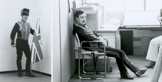
The Pritchard Museum
Jeff was always scouring the shops around Vancouver for items to add to his collection of accessories from old British military uniforms. He would often show-up in the design department excited about his latest purchase of rare brass buttons, insignia badges, military medals, service ribbons, and so on.
Jeff, modeling one of his uniforms in the design department.
I didn't know it at first, but Jeff wasn't just collecting, he was also researching. He used many of these items as detailed reference for some of his paintings.
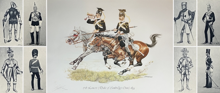
After a dinner with Jeff and his wife at their North Vancouver home, I was invited to the basement to see where Jeff kept his collection. It was impressive, and more like entering a well-curated museum.
Full-dress British military uniforms were exhibited in glass cases, along with tables and cabinets displaying other items from his collection.
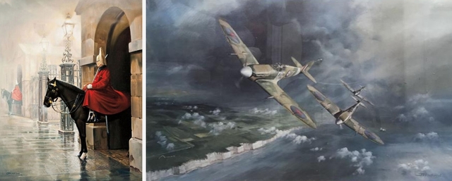
His paintings were also on display, including several of his classic aircraft pieces.
Because of his attention to detail, and the historical accuracy of his work, limited edition prints of many of Jeff's paintings have become prized collector's items.
Station ID’s
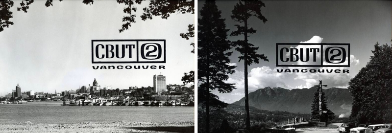
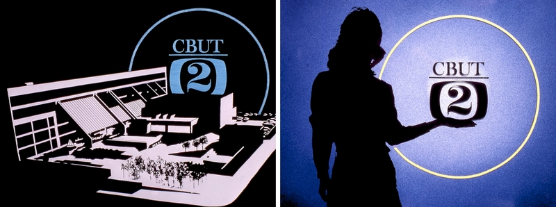
In the early years of CBC Television, station ID’s were generally B&W beauty shots of various Vancouver locations with the addition of a “CBUT 2 VANCOUVER” logo.
Station ID's CBC Archives, 1955
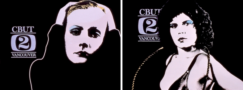
Later on, probably beginning in the 60’s, the ID’s became more varied, and the graphic designers were given the freedom to “get creative” and use their own personal styles. As a good example, here are 3 of Jerry McLaughlin’s beautiful CBUT station ID’s created between 1965-72.
Jerry McLaughlin, 1965-72 Photos: radiowest.ca
I don’t recall ever being asked to create station ID’s, or hearing any of the other graphic designers being asked, either. It just seemed to be something we were expected to do, when we felt like it, in our spare time. And, in general, it was considered an enjoyable diversion from making the usual graphics for productions.
We would simply get slides made of our artwork, and forward them to the department responsible for placing them on air, (telecine?). There wasn’t any approval process I was aware of.
Here are some typical (and slightly damaged) station ID’s I made at the time…
Station IDs
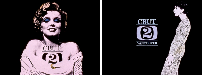
In 1977, I created a series of Station ID’s that I thought were kind of fun. I had the slides made, and passed them along to the usual department for on-air use.
Station IDs
Several days later, Jeff came to the office furious about a Station ID he’d seen on air the night before. We determined it was one from my new series, and he informed me it was a piece of crap.
I don’t know if he personally had all the slides removed, but none of the other ID’s in that series ever made it to air.
In retrospect, perhaps Jeff was right. While the images may have been "fun", they probably were not appropriate as station ID's. (Not to mention, I didn't have the rights to use any of the images.)
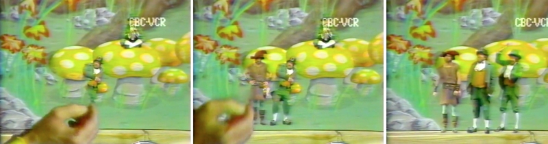
Leprechauns on Mushrooms
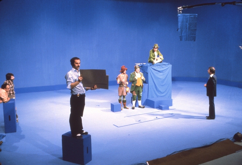
The Irish Rovers shows were extremely popular and continued to be produced at the Vancouver studios. The chromakey segments were also a fan favorite, with scale models, oversized set pieces, and detailed illustrations often serving as background environments for the live-action leprechauns and other characters.
Because of his superior drawing & painting skills, Jeff Pritchard always had the assignment to create the illustrated backgrounds.
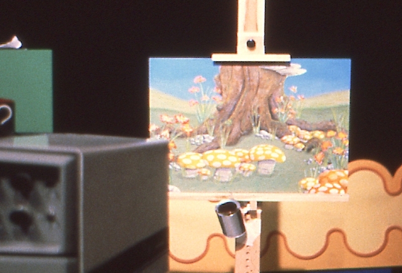
One day, for some unknown reason, I was given the assignment to paint the background for an upcoming Irish Rovers chromakey segment. I tried to decline, insisting it was Jeff's usual assignment, and that I wasn't an illustrator and would never be able to match the quality of Jeff's work.
But, it seemed Jeff didn't want anything to do with it. So, I was stuck with the assignment. And, I have to admit, a little terrified.
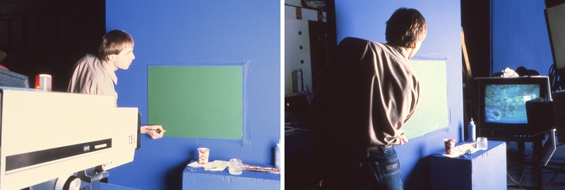
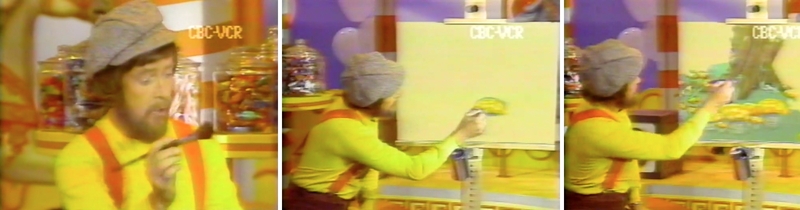
The concept for the segment was different than usual, and called for Will Miller to "paint" the background environment, himself, on a blank canvas set-up on an easel beside him in the studio. After completing the background, he would then "paint-in" three leprechauns.
The only direction I received was that the segment would take place at the base of a large tree surrounded by flowers, and several mushrooms for the leprechauns to sit on.
I was given a couple of weeks to complete the painting, using any free time I had between working on the evening news and other shows. After a shaky start, I finally got into it and started to enjoy the process.
The painting wasn't a masterpiece, but it did the job, and didn't look too out of place when compared with previous leprechaun chromakey segments.
In the end, I learned a lot, and was happy to have been given the assignment.
Completed background painting in test position on easel
Chromakey studio setup L to R: Ian Belcher, Chris Meakes, Fred Ramsay, George Miller, Jimmy Ferguson, Will Miller, Ken Gibson
Adding guide lines to Will Miller's blank chromakey panel
Will Miller "painting" the background and adding leprechauns
Leprechauns on Mushrooms chromakey segment (Sorry, low resolution & no audio)
Reach for the Top
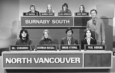
Reach for the Top was a popular, long-running quiz show with student teams from various Vancouver-area high-schools competing in a kind of round-robin tournament. One half-hour program aired each week, but the recording of multiple half-hour shows took place over a period of one or two days.
As in most game shows, a contestant would press a button and their name would light up. One of the jobs for the graphics department was to create all those back-lit student names for the set.
Reach for the Top with host Terry Garner Photo: Jack Lindsay, around 1975
A “system” had been put in place (before my time) with individual transparent letters being attached to frosted plexiglass panels using black masking tape. It was cumbersome and ridiculous, and a real pain in the ass every time we had to create the several dozen student name panels for those studio sessions. Not one of my favorite jobs.
Click on the image link below to visit the "More Graphics" pages.
Time to Go
Around the beginning of 1978 I started to feel I was "coasting" at work. I had a great job and was making plenty of money, but I was becoming too comfortable and not growing as a designer or an artist.
I still felt as young and naive as when I started, and could see my professional limitations when comparing myself to the other designers. I knew things would never improve as long as I stayed in that job.
I came to the conclusion I should quit and move to Paris. (Say what?)
The plan was to give up the West End apartment, sell my furniture, my car, and everything else I owned and, by the end of summer, move to Paris on a student visa.
I still had another 6 months to go at CBC, but things changed quickly for me after I made that decision to leave.
I had spent a lot of time with LB during the years following that last Hourglass party in 1975. We were good friends but, to my frustration, our physical relationship never went beyond kissing.
Then, in early 1978, at 22 years of age, I finally lost my virginity... to TR, a woman who worked in the news department.
And, in March, I fell madly in love with TK, a designer who worked in the costume department.
We met in the CBC cafeteria after I asked makeup artist Maurice Parkhurst about the attractive, creatively dressed woman seated at the other end of the room. He grabbed me by the elbow, dragged me over to her table, and made the introductions.
Thank you Maurice.
Maurice Napping on Bench Outside the CBC Cafeteria 1978
Soon, I no longer felt so naive, and I was more sure than ever about the decision to quit my job and move to Paris.
I left Vancouver and the CBC around the middle of July 1978, "... for reasons of career development and cultural enrichment”, as Gerald Trottier so kindly wrote in his letter of reference for me.
After an adventurous drive across Canada and a month at a remote ocean-front cabin in Nova Scotia, (with TK), I arrived in Paris around the middle of August, 1978.
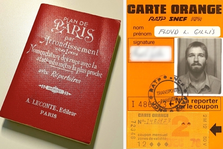
My (essential) "Plan de Paris" and Paris Metro monthly pass
Time to Return
Several months later, TK also quit her job, sold everything, and in late December joined me in Paris. But, things didn't go as expected. (Another story). Instead of my plan to stay in Paris for at least 2 years, we left France, making brief attempts to live in Tunisia and Crete before returning to Vancouver in early 1979.
It wasn't long before I needed a job and went back to the CBC design department as a graphic designer.
To my surprise, a rumour had spread throughout the CBC design department that I had "turned gay" while living in Paris. It was news to me.
There were a few new faces, and Gerald Trottier was still head of the design department. Other than that, nothing much had changed at CBC, (or with me), and I can't even recall the projects I worked on during that short time.
Time to Go
It didn't take long before I decided to quit again, but this time, to go back to school. I was accepted in the BFA program at NSCAD, (Nova Scotia College of Art & Design), and my college credits from VCC Langara enabled me to enter as a 3rd year student in the 4 year program.
I left Vancouver and the CBC around the middle of August 1979, immersed myself in the BFA program at NSCAD, and began a "new life" in Halifax.
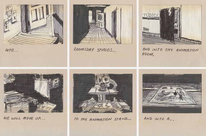
I became involved with the Atlantic Filmmakers Co-op, and Doomsday Studios, where owner/producer/director Ramona Macdonald ran a film production company. Doomsday Studios also had a high-end 16mm animation camera and stand, which I used to create my short animated film "Perspectives".
During the production of "Perspectives" I met John S. Gray, the composer/musician who would create the soundtrack for the film. We became friends and went on to collaborate on other animation/music projects and live performances in Toronto and Halifax galleries.
To earn additional money I also did freelance graphic design work for CBC Halifax, making generous use of NSCAD's darkrooms and equipment.
Feature Films
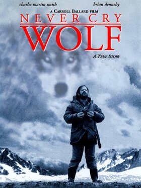
In July of 1980 I visited TK in Skagway, Alaska where she was working on the feature film, "Never Cry Wolf", directed by Carrol Ballard.
During the short time I was there, I also ended up working on the movie, and the experience changed the course of my life.
More details about my experience on "Never Cry Wolf" will eventually be posted HERE.
When I got back to Halifax, I decided not to complete my final year of the BFA program at NSCAD, but instead, move back to Vancouver and work on feature films.
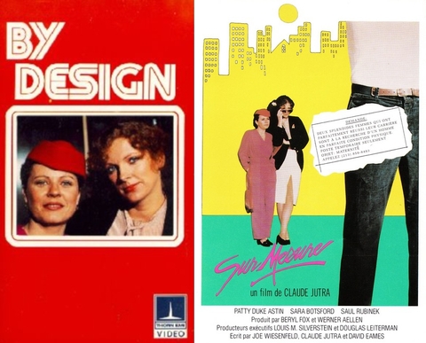
I finished the animated film I'd been working on for 9 months, tied up all my other loose ends, and was back in Vancouver by October of 1980 to begin work as Head Scenic Artist (a fancy title for "painter") on "By Design", directed by Claude Jutra.
More details about my experience on "By Design" will eventually be posted HERE.
It was a big disappointment, and nothing close to the remarkable experience I had while working on "Never Cry Wolf".
In fact, TK and I both resigned around mid-December, before the end of production, because of "creative differences" she had with producer Beryl Fox.
Freelance Design
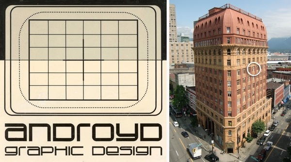
Over the following months I worked on a number of freelance projects and opened a design studio on the 8th floor (room 801) of the Dominion Building on Hastings Street.
Design studio logo & Dominion Building Photo Credit: Bob_2006 (Flickr)
I also enrolled in a (life-changing) computer animation course at SFU (Simon Fraser University) titled, "Art & Computers", taught by Jerry Barenholtz. And, soon after that, I became obsessed with computer animation and learning to program.
Time Lines (excerpt, SFU/GRAX 1981) Music: John S. Gray
I couldn't afford to buy my own computer, so I would hang out at various Vancouver stores that had PCs on display, like, Radio Shack, home electronics shops, and even some department stores.
Once I got on a machine, (after waiting impatiently for young kids to stop fooling around on them), I'd spend as much time as possible, with an instruction book, learning the "BASIC" programming language. Eventually, I'd be asked to leave the store, so I'd just move on to the next one.
My freelance work and budding interest in computer animation wasn't paying the bills, and by the Fall of 1981 I was, once again, back at CBC as a graphic designer.
The "New" Design Department
It soon became clear the CBC design department had gone through quite a few changes since I last worked there back in 1979. For example:
1. Many of the senior designers from the 1970’s had retired, (except Lawrence Collett), and the new designers were all relatively young.
2. CBC Vancouver was being replaced as the premier production center in Western Canada by the rapid growth of the commercial and feature film industries on the West coast, and many experienced CBC employees were leaving, or had already left, to work in those industries.
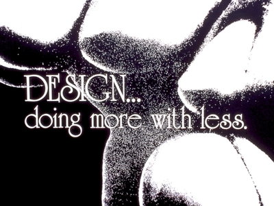
3. Nationwide, CBC was suffering from years of budget cuts and the constant pressure to do more with less. Bob Lawson, the new head of the design department, even initiated a “Design. Doing More With Less” campaign, having me create artwork for the T-Shirts that were distributed to everyone in the design department.
Design Department T-Shirt Design 1981
Perhaps it was a combination of all the above but, by the early 80’s the design department had gone “WACKY”, and I was only too happy to join in.
This isn’t to say the quality of work suffered. The department was filled with extremely talented designers and artists, but there seemed to be more need to occasionally “blow off steam”.
Office Chair Races
Pushing backward around the design department on wheeled office chairs was always great fun, but every so often we’d get the urge for a seriously challenging, long-distance race.
From a starting point at the southern-most end of the building, we would speed through the design department, out the doors, past the elevators and into the next department, (accounting?), to the dismay of those working quietly at their desks.
Hootin’ and hollerin’, we jockeyed for position while racing north through the building.
Upon reaching the next bank of elevators we would execute the perilous U-turn, often resulting in collisions and flipped racers, and head back southward.
During our second pass through the (accounting?) department, the dismay of the first pass gave way to anger and verbal abuse, adding incentive for us to get through as quickly as possible, past the elevators, through the design department doors, and on to the finish line.
After repeated warnings and growing threats to shut down their (accounting?) section of the race course, the design department office chair races came to an end.
Boss Alarm
It soon became clear we needed a “boss alarm” for those times Bob Lawson would unexpectedly visit the design department. After much debate and testing we settled on the “Cooo, loo, coo, coo, coo, coo, coo, coooo” theme from Bob & Doug McKenzie’s “Great White North” segment on SCTV.
The Boss Alarm
The alarm was a great success, and clearly audible from any of the cubicles throughout the department.
One day during lunch in the cafeteria, a group of us were sitting around talking and laughing when Bob Lawson suddenly appeared, out of nowhere, standing right behind John Willett who was in the middle of one of his stories.
Sitting directly across from John, I immediately let loose with the “Cooo, loo, coo, coo, coo, coo, coo, coooo” boss alarm. John halted his story, stared straight ahead, and blurted out, “He’s right behind me, isn’t he?”.
Bob and John then attempted to carry-on a serious conversation about some production design related issue, while the rest of us tried to stifle our laughter, with little success.
Blowguns
Naturally, the design department went through a “blowgun” phase. I believe it was John Willett, Glenn Patterson, and Ray Mah who placed the order from a hunting magazine where the blowguns were marketed as the ideal weapons for hunting squirrels, birds, varmints, and small monkeys.
The four-foot long metal tubes, with their various accessories, darts, and feathers, finally arrived and for several weeks the south-end of the CBC’s second floor was a “kill-zone”.
I don’t remember anyone getting hurt, but we came close. And, having a dart whistle past your head and embed itself deeply into the wall beside you, quickly lost its humour.
Management finally had to step-in and put an end to the blowgun era when a section of wall was getting “pin-cushiony” and falling apart from too much target practice.
Diazo Brothers
The Diazo Brothers Band was probably the ultimate expression of the design department's wackiness of the early 1980s. And, damn, was it fun!
Click on the image link below to visit the "Diazo Brothers" pages.
Design Department "Re-design"
One day, Bob Lawson came into the Design Department and called for everyone to gather round so he could show us the floor plans he, and one of the assistant set designers, had drawn-up for the re-design of the design department.
Everyone understood space was getting tight, but it was the first time most of us had heard anything about a “re-design”.
I was feeling kind of cocky and blurted out something about being surprised and disappointed that none of us knew about the plans beforehand or had been asked for our input.
Bob immediately shot me down saying, “Your opinion doesn’t matter, you’re only a temp here”. (Which was true at the time.) To which I replied, “That’s the big problem, none of our opinions matter to you”.
Well, that started things off, and everyone became quiet.
I took a quick look at the plans and noticed a third hallway added down the middle of the department to (supposedly) accommodate 2 additional offices. After a quick calculation, I told him the third hallway was unnecessary and a waste of space, taking up at least 120 square feet.
Then, looking closer at the plans, I noticed something else, and asked why the set designer offices had all become larger and the graphic designer offices had all become smaller. Without missing a beat, Bob answered, “Because, traditionally, that’s the way it’s always been.” (Bob was an accomplished production designer for the CBC, back east, during the 1950's & 60's.)
I started getting angry, and Bob’s face began to turn (more) red as he got angry, too.
I’m not usually "quick on my feet", especially when angry, and knew I was about to make a complete fool of myself. That’s when I noticed Lawrence Collett standing directly behind Bob. He was signaling for me to relax. (Thank you, Lawrence.)
I stopped, took a couple of deep breaths, then said to Bob, “When I look at Danny Chan’s office and Sharon Romero’s office, I wonder, who needs more space?”
Danny Chan, was a set designer, with a refined, minimalist style, who kept his office meticulously clean and free of clutter. Sharon Romero, on the other hand, was a graphic designer whose office was always overflowing with reference books, magazines, and all kinds of artist’s materials and tools.
My comparison was unfair, and there was no way for Bob to answer the question diplomatically, especially with Sharon standing right there.
He left the design department, and the assistant set designer picked up the plans and followed him out.
That was the last we heard of the re-design of the department. And, I wasn’t fired.
Giggles
One set designer who joined the CBC in the early '80s was Stephen Geaghan. Steve worked on many of the larger shows, and went on to a successful career as a production designer, art director, and even producer on TV movies and series.
I liked Steve. He was talented and always ready to take part in the design department wackiness. His nickname was "Giggles".
But, Steve "lost" me one day while enlightening us on how it felt to be a "production designer".
With his hands out in front of him, and wiggling his fingers, he explained how they were like paint brushes, each one controlling a different department. One "paint brush" was the costumes department, another the carpentry shop, another the graphics department, another the paint shop, and so on.
Well, I didn't appreciate being a paintbrush on the tip of one of Steve's wiggly fingers. 🙂
♦
Steve had some kind of thick, furry rug (a faux polar bear rug?) under the large drafting desk in his cubicle. It looked so soft and inviting that, one night, my girlfriend and I decided to make use of it.
Things were well under way when the security guard unexpectedly entered the design department while making his rounds. There wasn't time to dress or even cover ourselves, so we stayed as still and quiet as possible, waiting and hoping for him to leave.
At one point it sounded like he was at the entrance to Steve's cubicle and had briefly looked in.
Maybe he didn't notice us under the desk, or maybe he was just being discreet but, after that, he quickly left the design department.
Later, when leaving the building, we exchanged "Good Nights" with the security guard as we passed him in the lobby. I stayed by the doors as my friend went back to ask him his name. I don't remember it, but she might have made a note of it.
Keystone Kops
One day I got an urgent call about something wrong with the closing credits I made for a "roll-drum" machine. When I got to the studio, the cameraman was complaining my lines of text were not parallel.
I put a lot of careful work into my graphics and was, perhaps, overly sensitive to criticism.
I got angry and told him there was nothing wrong with my graphics, but his camera wasn't pointed straight and this was causing a "keystoning" effect.
And, how in the world could I make a credit roll where the text was tilted one way at the bottom of the frame, then tilted another way when it got to the top?!
Straight and keystoned
He acted like he wasn't convinced and kept insisting the problem was with the credit roll. I probably said some things I shouldn't have and stormed out of the studio and through the control room, where I received some strange looks.
The camera operators were professionals and would absolutely know if they were "keystoning" or not. It wasn't until (years?) later I realized they probably knew I was kind of touchy about my graphics, and were just messing with me.
Looking back on it now, it must have been really quite funny. Bastards! 🙂
Motion Graphics
With experience in 16mm film animation and basic computer animation, plus exposure to the latest computer-assisted motion graphics airing on U.S. television, I was anxious to put more "life" into my own graphics.
This meant adding camera motion, lighting effects, and other types of "animation".
Edge lighting effect keyed over graphic card
Camera motion and studio lighting effects
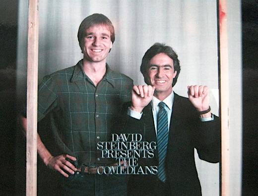
3D letters glued to a glass plate With David Steinberg
For a "Merchant of Venice" opening we used a chess board with all the pieces glued in place. By rotating the board as the camera zoomed or dollied over it, we tried to recreate the swooping moves you might get from an aircraft flying over a landscape. It "sorta" worked, but I was disappointed with the results.
Another opening we created was for "See BC". I used 9 cubes, in a 3x3 array, rotating to resolve as the show logo. Each cube was shot separately against green screen in a studio at CBC, but the video elements were taken to Post Haste (a new post-production facility with all the latest video and effects equipment) for final editing.
"See BC" element layers chart Used for the edit at Post Haste
As we added more layers, keying the cube elements on top of each other, the video quality started getting extremely ratty... not what I was expecting with all the new gear.
Again, I was disappointed with the results. And, on top of that, the editing process was painfully slow.
Not long after, I made a casual joke in the CBC design department, calling the post-production company "Slow Paced". Somehow, this quickly spread throughout Vancouver's production community.
When confronted by one of the principals of Post Haste about the "Slow Paced" slur making the rounds, I vehemently denied knowing anything about it.
I know it's more than 40 years too late, but, I'm sorry.
In Post Haste's defense, their operators were still training on the new equipment and the company was upfront about the project with CBC being a highly discounted test of their new facility.
CUPE / NABET
In the early 1980's character generators were becoming increasingly sophisticated and more electronic graphic effects were starting to be used in production.
I could see that much of the work we were doing in the graphics department would soon be created using these new systems, and I wanted to make the jump to the technical side of things.
A job opening was posted, "TV Technician (Video Character Generator)", and I immediately wrote a letter to Irene Coutts (Human Resources) letting her know I was extremely interested in the job and how my years of television graphic design experience would be a valuable asset for the position.
However, everyone in the design department (including me) was a member of CUPE, (the Canadian Union of Public Employees).
While anyone operating technical equipment was a member of NABET, (the National Association of Broadcast Employees and Technicians).
And, as in, "East is East, and West is West, and never the twain shall meet", there was a clear, and strictly enforced separation of "who-was-allowed-to-do-what" on a production.
One, small example: I was always fascinated by all the electronic equipment involved in video production, especially the new, cobra-like cameras used in the studios. One day, during a break in shooting, (the studio was not "locked down" for continuity), I "pulled focus" on an unattended camera by slightly twisting the control on the main handle.
Cool!
What an uproar ensued! A technician from the other side of the studio came running over, got in my face, and started yelling at me for "touching" the camera.
Not cool!
Anyway, I don't recall hearing back from Irene, and I didn't follow up. I was too busy trying to dive into computer animation and programming, and soon saw a "Video Character Generator" position as too limited.
The Apple II
It was a struggle learning to program without full-time access to a computer.
Additionally, I was in a situation where I quickly needed to find a new place to live.
Luckily, I was offered a rent-free stay in a house in North Vancouver, if I agreed to clean it up (inside and out) in preparation for it being put on the market for sale.
The house was owned by BA and his ex-wife NW. BA was a production assistant I had worked with at CBC, who was now an assistant director on feature films. He was going to be away on location for several months, so I had the place to myself.
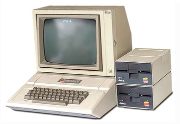
And, to my good fortune, BA owned an Apple II computer that I was free to use as much as I liked!
Apple II
The place was a mess and it took several weeks of hard work to clean up the front and back yards, garage, and the inside of the house, (while also working full-time at CBC). I even re-arranged all the furniture and re-organised the kitchen.
Having unlimited use of the Apple II more than made up for all the time it took.
The last room to take care of was BA's bedroom, and I was really hesitant about entering. Eventually, I worked up the courage and went in.
It wasn't as bad as expected and I had it cleaned-up and re-organised in no time. I just hoped BA would appreciate how nicely I had stacked all the magazines, (featuring women with extremely large breasts), that were scattered under his bed.
Everything looked great when NW came to see if the house was ready to put on the market. She was pleasantly surprised, and soon, prospective buyers were coming-by to view the property.
Eventually, the feature film BA was working on finished shooting and he returned home.
BA and I didn't talk much when we were at the house together, but he did show me how to use the floppy disk drives on the Apple II, and for that I will be forever grateful.
He also didn't say much, if anything, about the house being cleaned-up and organised, or about how neatly I had stacked all his magazines.
What he did do was slowly, but surely, return the house to the mess it was in before I got there.
Not wanting to become BA's maid, I moved out.
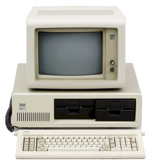
The IBM PC
I rented an apartment at Cambie Street and 14th Avenue, which made the commute into CBC so much easier, but I was desperate for access to a computer so I could continue learning to program.
The animated film I made while in Halifax had done well on the international film festival circuit, which led to me receiving a Canada Council Arts Grant to create another film.
The "Next Film"
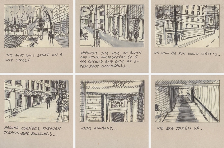
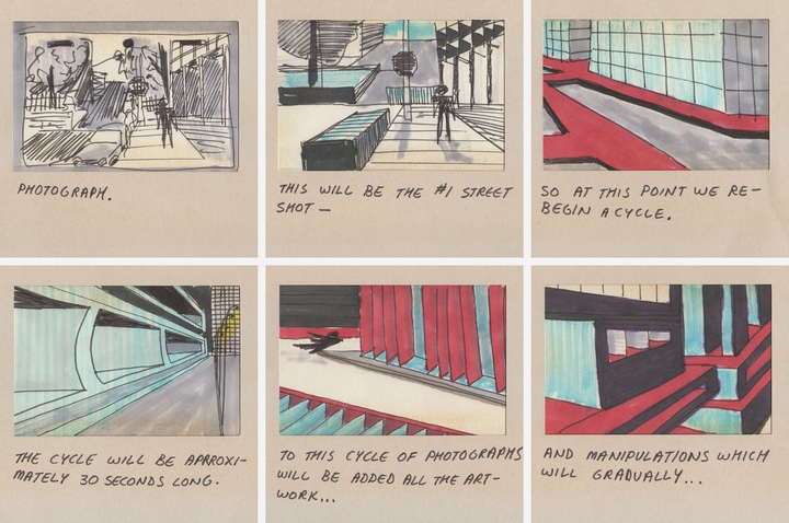
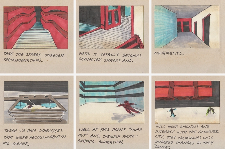
These storyboards were created as part of the Canada Council Arts Grant application process.
Since the end of 1980, I'd been sitting on the grant's first half payment ($5,000.00) that was supposed to go towards my next film, but I used the money, instead, to buy one of the new IBC PCs with a graphics card option.
IBM PC
I spent most of my free time programming graphic elements like points, lines, 2D and 3D shapes, colors, and so on, that could be animated around the screen and controlled in real-time by pressing keys on the keyboard.
Fortunately, the Apple II, IBM PC, and other PCs at the time all seemed to include a version of the BASIC programming language. So, it wasn't difficult to make the transition to the new machine.
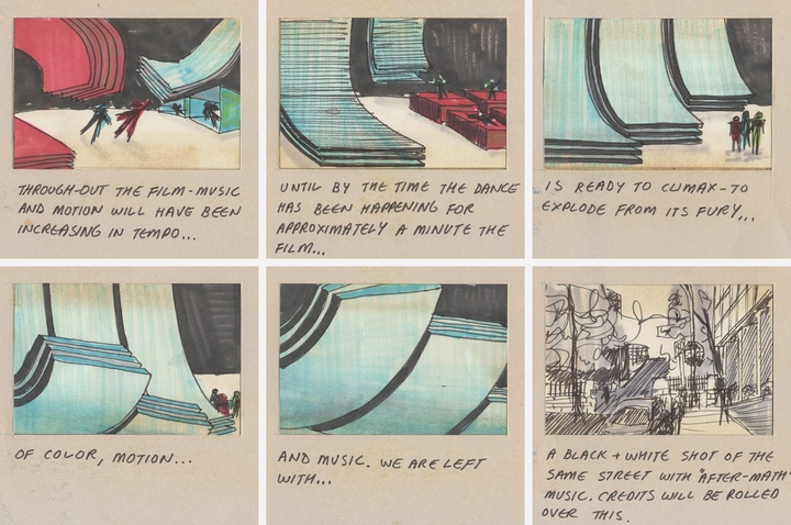
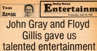
This led to live music/animation performances in Toronto and Halifax art galleries with John S. Gray, in June of 1982. John improvised on piano and synthesizers, along with pre-taped sound and music elements, while I improvised on the computer with pre-programmed, keyboard-controlled images and animations.
Review headline Halifax Daily News, June 30, 1982
SIGGRAPH '82
In late July of 1982, on the recommendation of Jerry Barenholtz at SFU, I made the pilgrimage to Boston to attend the 9th Annual ACM SIGGRAPH conference. (Association for Computing Machinery, Special Interest Group on Computer Graphics and Interactive Techniques)
This was my first exposure to state-of-the-art computer animation being created at research labs, universities, and commercial facilities from around the world. It was also a showcase for the latest hardware being used to generate computer images and animation.
That SIGGRAPH (my first of many) was yet another life-changing experience for me.
It was now obvious to me that most, if not all, the work we were currently doing in the graphics department at CBC would soon be created on computers.
Upon my return to Vancouver I was determined to focus on computer animation.
By coincidence, Vertigo Computer Imagery, a small computer animation start-up, had recently opened at 119 West Pender Street, not far from the CBC.
I soon met with the principals of the company; Steve White, Fred Daniels, & Mike Parker, and programmer Toby Baden. They agreed to let me spend as much time there as I wished, (unpaid), so I could learn to use the hardware and software.
In exchange, they would now have someone in the studio with broadcast graphics and animation experience, and any imagery I generated could be used in their demo reels and promotional materials.
More details about my experience at "Vertigo" will eventually be posted HERE.
Working at CBC during the day, and spending most of my nights at Vertigo, I was spreading myself pretty thin, and periods of 1982 & 1983 remain hazy to me, probably due to the lack of sleep.
After going long hours without sleep I would begin to hallucinate. In my peripheral vision I would catch brief glimpses of dark little creatures running around on my desk. As I went more hours (days?) without sleep the creatures would move inward until, finally, they were running back and forth on my desk between the keyboard and monitor.
Super Computer I
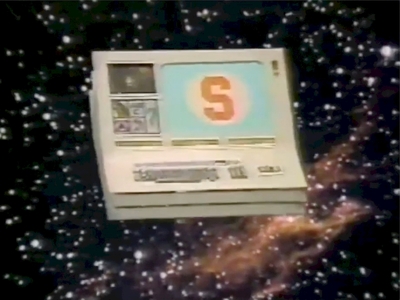
Cathy Chilco, a producer at CBC, was creating segments for the Canadian version of Sesame Street. She must have heard about me generating animations using a computer, and I was soon working on "Super Computer", a new segment for Sesame Street featuring a child solving puzzles while interacting with a computer.
I designed and drew up the construction plans for the prop computer to be built by the carpentry, paint, and lighting departments at CBC...
Super Computer
... and wrote all the programs for the animated graphics while at home. On the day of the "Super Computer" shoot, I brought my IBM PC to the CBC studios.
We had a problem.
There was no way to sync the video signal coming from the primitive graphics board of the PC with CBC's high-end broadcast equipment. Thankfully, after some scrambling, one of the technicians cleverly found a way to make it work.
I sat down in front of the keyboard and monitor and started running my "Super Computer" animation programs.
We had another problem.
I was a member of CUPE, not NABET, and not permitted to operate any electronic equipment! I got angry, maybe said some things I shouldn't have, but finally had to give in.
I pulled out my cheat-sheet showing the mapping of keyboard keys to specific animation functions, and gave a crash course to one of the technicians.
I don't remember anything after that. I don't even remember being in the studio or control room during the shoot.
To be honest, I also don't remember what the animation looked like.
Days later, when I eventually saw the final edit, I do remember being generally happy with how it turned out.
Leave CBC (Again)
In November of 1982 I left the CBC, (third and final time), for a full-time (paying) position at Vertigo Computer Imagery.
I had good friends at CBC and was still a member of the Diazo Brothers Band, which meant I often returned to the design department for visits or to join the "Brothers" for various group events, rehearsals, and performances.
Super Computer II
The first Super Computer segment that aired on Sesame Street was well received, and I was approached by Cathy Chilco to create more segments. Woo-hoo!
However, when it came to programming, I was at the height of my "A little knowledge is a dangerous thing" phase and ended up biting off more than I could chew.
It's still fuzzy, but according to sketches, notes, and snippets of code in one of my old journals from 1983, I planned to build at least 3 new puzzle games that could be played by using a light pen with the monitor.
The first game involved re-arranging several basic shapes, like triangles and rectangles, to form the image of a sailboat.
The second involved re-arranging fourteen musical notes to play the first four bars of "Frère Jacques".
And the third involved moving a watering can through a maze to water a dry plant.
I had several weeks to complete the design and programming of the animations, but I started having repeated computer crashes, out-of-memory errors, and other issues.
I was able to fix most of the problems and remained (overly) confident everything would be ready in time for the scheduled recording date.
Well, on the morning of the shoot, and after several days without sleep, I showed up in the studio control room at CBC and told Cathy Chilco the animations were not ready, and I didn't think I'd ever be able to finish them.
It was so last minute that the studio and control room were already filled with people prepared for the shoot!
Cathy didn't yell at me, or even look visibly angry. (Great producer!) She must have seen I was a wreck, dismissed me, and moved-on to salvaging the situation. I probably went home and slept for several days.
It was a low-point in my career, but I learned the important lesson of keeping others informed of my progress on a production and to raise "red-flags" if anything might affect the schedule.
I don't recall speaking with Cathy after that incident. I was probably too embarrassed to face her.
Below is a segment from a Sesame Street episode posted on YouTube by "Telly4Lyfe", and discussed in the forum of the "Muppet Central" website under "Super Computer!".
That's definitely the "Super Computer" I designed and had built, but it seems to have more flashing lights than I remember. And, the animation of the watering can going through a maze to water the plant, looks exactly like what I would have created on the IBM PC.
But, I'm still a little fuzzy on how this came together if I had a melt-down before the shoot?
Apparently, there's an earlier Super Computer segment out there, "Season 13: Episode 1637", but I haven't been able to locate it.
Conclusion (finally)
Many talented designers and artists came through the CBC design department. And, most of them went on to successful careers in theatre, movies, television, commercial design, fine arts, and other creative fields.
Below is a partial list of the graphic and set designers who were at the CBC while I was there between 1975 and the end of 1982.
There were several others, whose names I can't remember. Please send a note to, "info(at)floydgillis.com", with any suggested additions.
Graphic Designers
Kuni Masada ♦ Jeff Pritchard ♦ Rick Staehling ♦ Peter Ahrens ♦ Wayne Hildebrandt ♦ Ray Mah ♦ Glenn Patterson ♦ John Rix ♦ Sharon Romero
Set Designers
Lawrence Collett ♦ Murray Devlin ♦ Victor Miles ♦ Dan Philips ♦ Michael Bolton ♦ Danny Chan ♦ Gary Ferguson ♦ David Fischer ♦ Stephen Geaghan ♦ Douglas Higgins ♦ Graeme Murray ♦ John Willet
There were also many talented costume designers, but their offices were usually located near the costumes department, in another part of the building. So, unfortunately, I don't remember many of their names.
Even though I was at the CBC, on and off, for only 7 years, (much shorter than many who'd been there for decades), my time and experiences there had an enormous impact on my life and career.
The CBC design department was an incredibly creative environment, and I was fortunate to have been surrounded and influenced by so many professional designers, talented artists, and good friends.
I entered the CBC in 1975 as a young kid and left in late 1982 as... well... an older kid.
And, I still find myself telling people I grew-up in a television station.
It was a wonderful ride.
Thank you CBC!
Addendum
In early 1983 I was back at the CBC design department visiting friends and (possibly) to take part in a Diazo Brothers rehearsal. By coincidence, a presentation related to "computer animation" was scheduled for that day, and I was invited to sit in.
The presentation was for a computer-assisted 2D animation system from Japan.
I was already working on far more advanced 3D animation systems, so I was not impressed. And, during the question and answer period, in front of all the CBC designers, I was a total jerk and smugly criticized the system the woman had just demonstrated.
She took it surprisingly well, and before she left I invited her to visit Vertigo, where we were using "real computer animation systems".
A week later, she arrived at the Vertigo studios and, to make a long story short, we were married about a year and a half later.